Care Baby Thailand
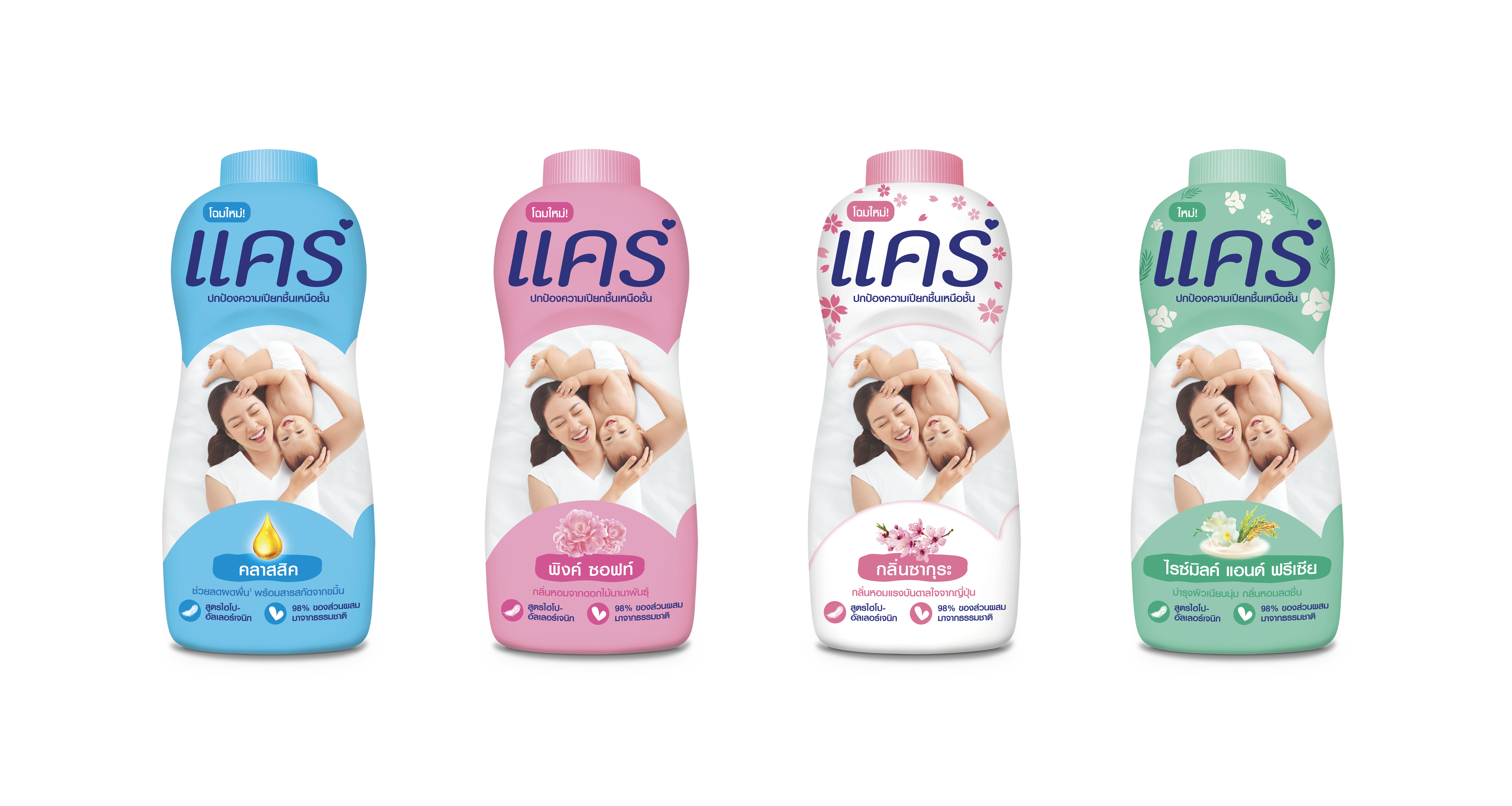
With the launch of their new formulation of talc powder, Care Baby Thailand wanted to introduce a refreshed packaging design that appeals to Millenials and first-time mums.
This relaunch aims to target mums who prioritize safe, organic products they can trust to enhance their babies’ skin health and comfort.
ABOVE Original packaging.
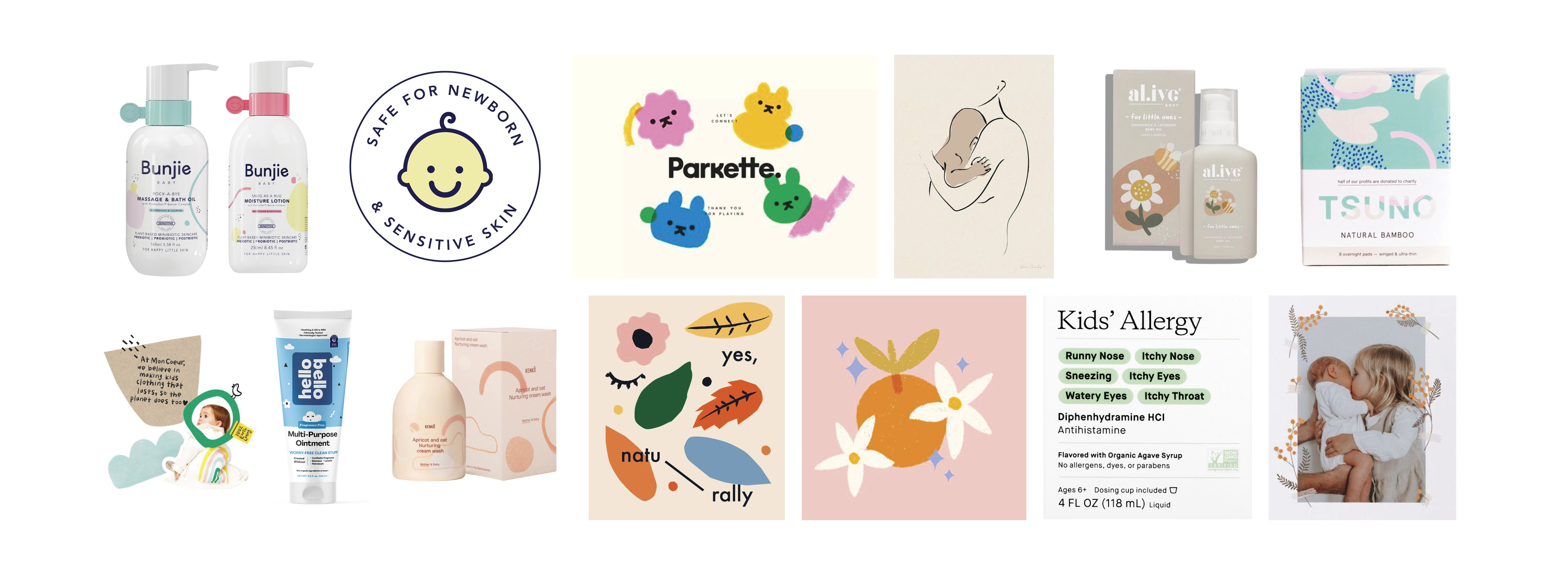
MOODBOARDING After extensive research and image collection, some of these references were funneled down to create different concepts and designs. We looked at soft organic baby brands for the illustration style.

R1 To start, R1 was a round of sketching and using basic shapes and colours to outline where elements can be placed, with the restriction being that the logo placement remained the same from the original. The exploration ranged from retaining the original layout with the brand ‘heartbump’ - to pushing the layout further and further. Here I explored different poses, icons and illustrations as well as how the design can be adapted into the other variants.

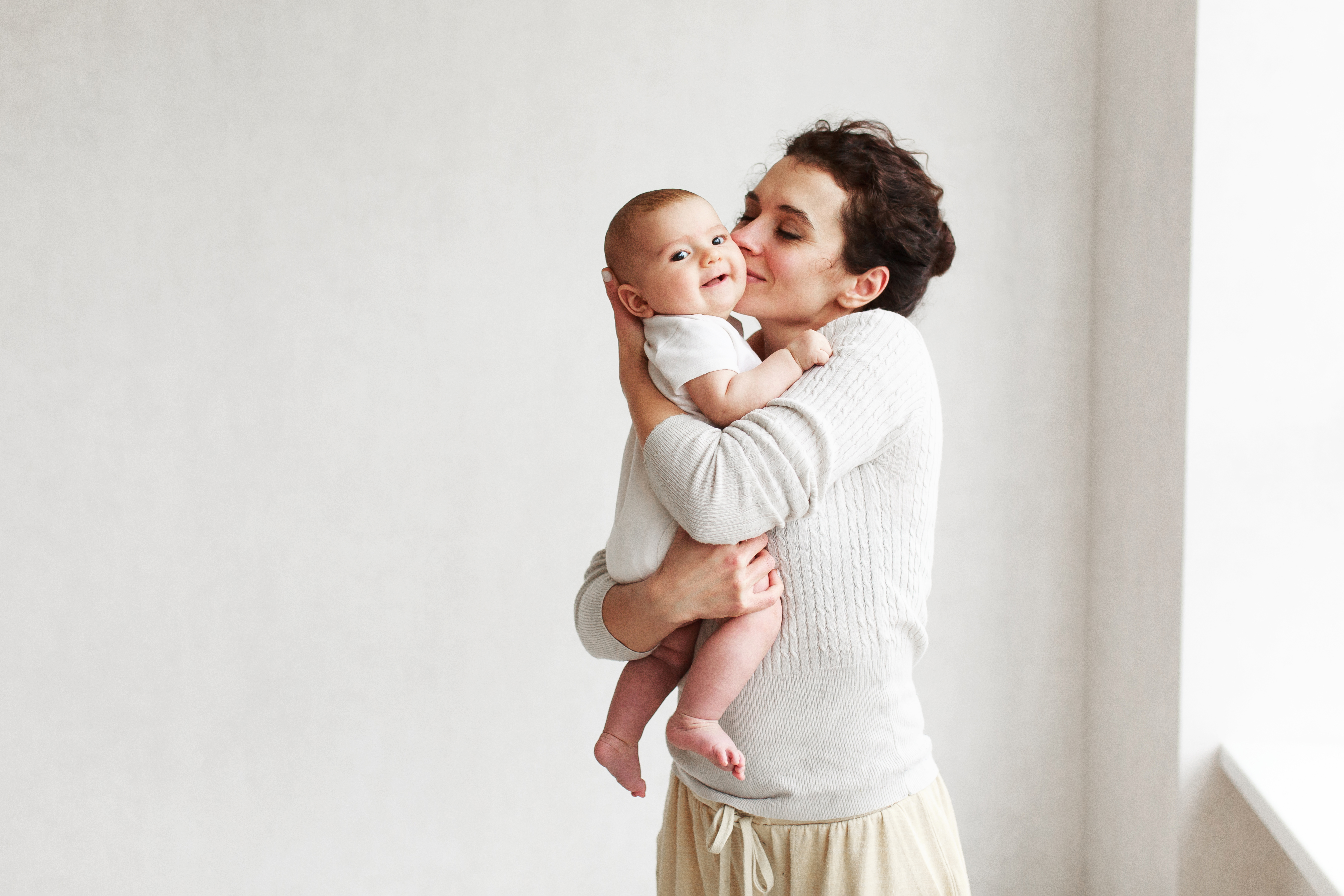
COMPOSITING/RETOUCHING We worked with a variety of images taken from Getty, which work as a stand in and reference for future photoshoots. While they are temporary references, the client wanted certain details to be in place - happy, lively baby model, short sleeves, and natural backgrounds.


CONCEPT After several revisions, this concept was one out of four designs selected for consumer testing. This approach redefines Care Baby as the expert in baby skincare, highlighting their DryLock Technology, while maintaining the fun element for babies.


The illustrations incorporates organic icons that highlight its baby-friendly qualities and serves to differentiate between the product variants. It also easily applies to any merchandise as a wider pattern.