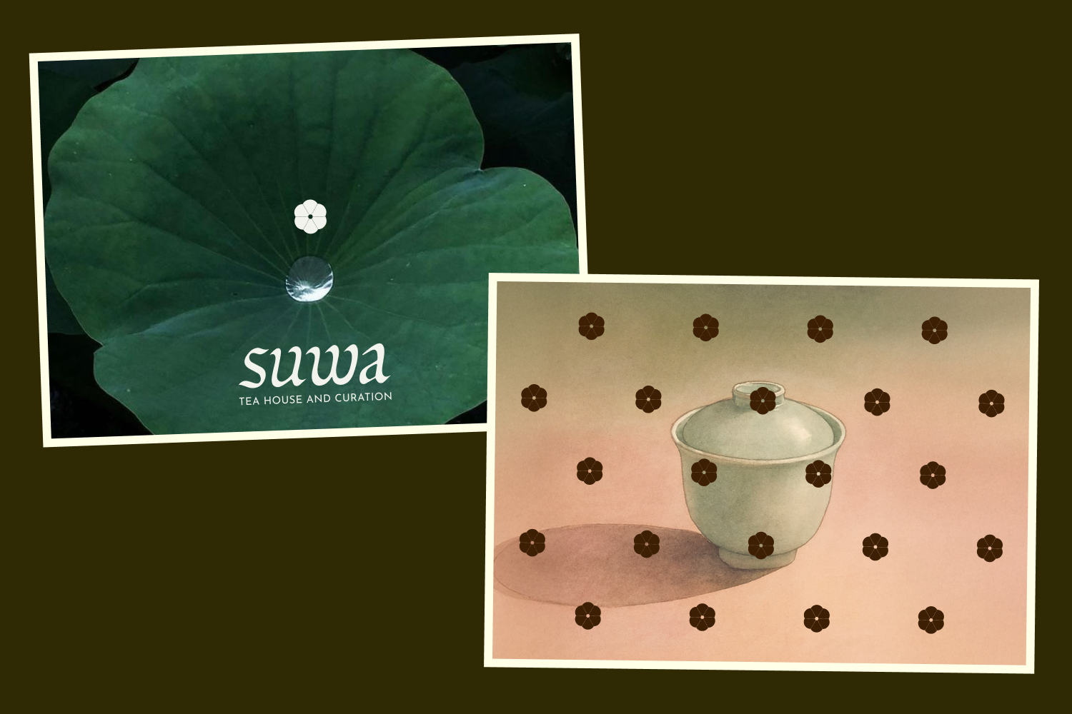
Suwa Tea House and Curation
Suwa is a curated lifestyle concept store in Jakarta. Clothing, homeware, and a contemporary tea bar held inside one intentional space. Rooted in Japanese-inspired simplicity, the brand is built around a slower rhythm of warmth, clarity, and the small rituals of tea.


MOODBOARD The work is inspired by the serenity of tea culture. The balance of ceremony, the fluid motions of pouring water, the gentle taper of tea leaves. These forms informed the typography, where soft curves and subtle points echo the rhythm of brewing. In the research, I also discovered the watercolours of Mark Adams, whose work captures this stillness I wanted to evoke. His paintings gave a tactile reference for the world of Suwa.

WORD MARK The first round explored three interpretations of tea culture. The first worked from the natural shape of the word, repeating the curve within the letters to build consistency and flow. The second leaned calligraphic; softer, tapered, drawn from handwriting. The third took a modern route, inspired by Japanese name stamps reworked into a clean, structured mark.
The calligraphic direction held the most of what Suwa was after.

BRAND MARK In parallel I tested ways to mark the brand to pair with the word mark. Leaf forms, abstract blooms, monograms, before landing on a simple six-petal flower.
![]()